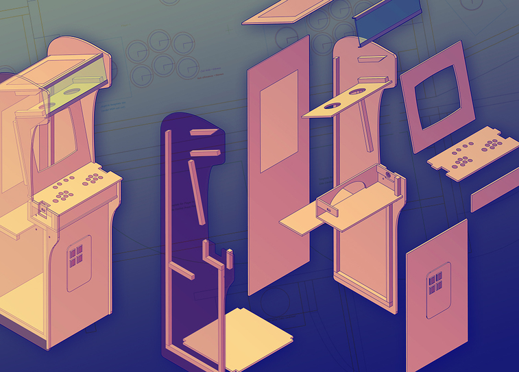
Creating a control panel and button layout for the Arcade Cabinet play surface wasn’t as simple as drilling some holes into a sheet of wood. It took some fiddling, research, and testing to get it right. Read on to see what we discovered when designing a control panel for our Arcade Cabinet to help plan yours.
The control panel has a few needs and musts that are restricted by the design of the cabinet, ultimately comfort should be the number 1 priority. This is because out of everything an Arcade Cabinet is, if it isn’t functional or comfortable it won’t be used.
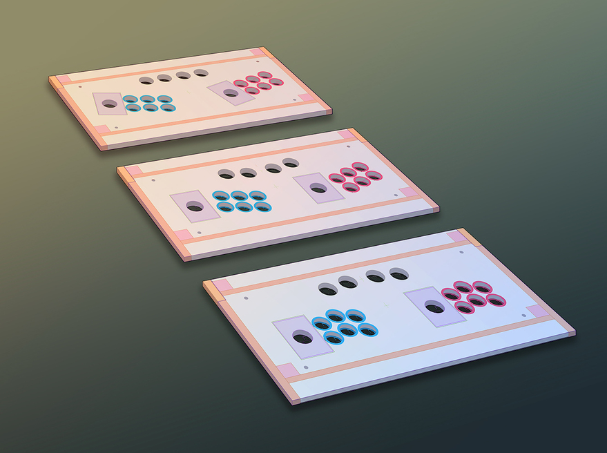
For our cabinet, the width was limited to 600mm which was due to the screen fitting nicely without a massive bevel and the ability to easily move it through household doorways. With such a tight dimension having two people standing next to each other playing and still having enough free movement of their arms and wrists is critical. Initial designs of the control panel had the sticks and buttons angled outward and away from the screen diagonally. The idea was that two players could stand next to each other with a gap and play without touching shoulders.
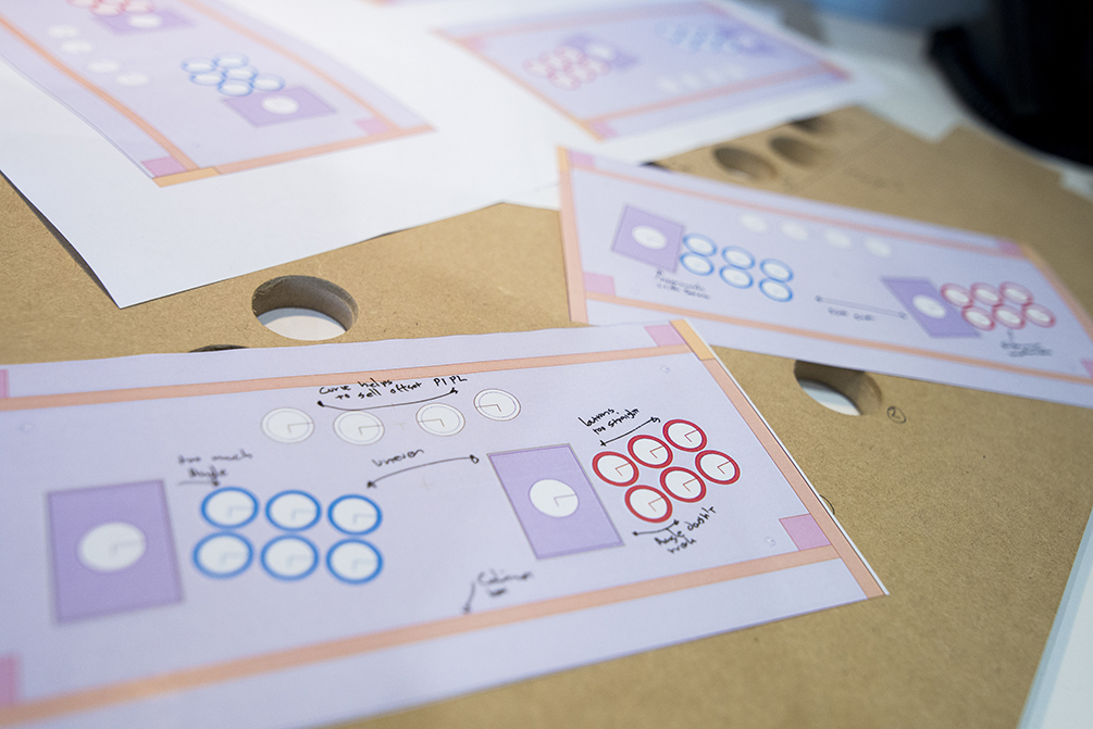
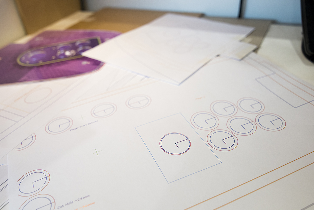
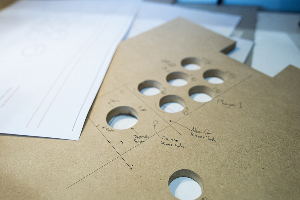
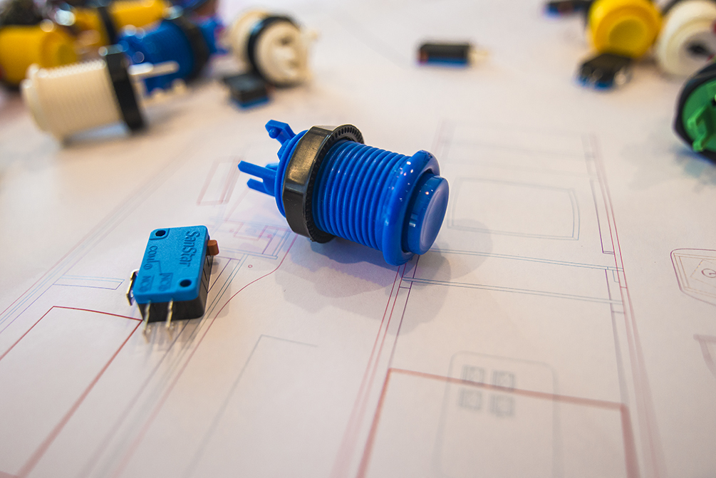
So the plans were drawn up, printed at 1:1 scale and laid out on a temporary panel for testing. The end result was that rotating the Joystick differently from the line of the cabinet front or screen panel left the player making too many mistakes. Even when standing off centre to the cabinet it was expected that UP is towards the screen and not rotated twenty degrees towards the centre.
This was a quick and simple test to an answer that the online community Arcade Cabinet maker enthusiasts also aligned with. The Joystick UP and DOWN motion should be parallel to the sides of the cabinet irrespective of the position the player is standing in. This was further confirmed when testing with a single player, if you angle the Joystick and a lone player is using the cabinet it further throws off the brains natural instinct to move the Joystick parallel and perpendicular to the cabinets sides and front.

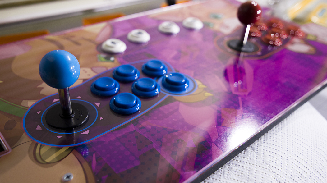
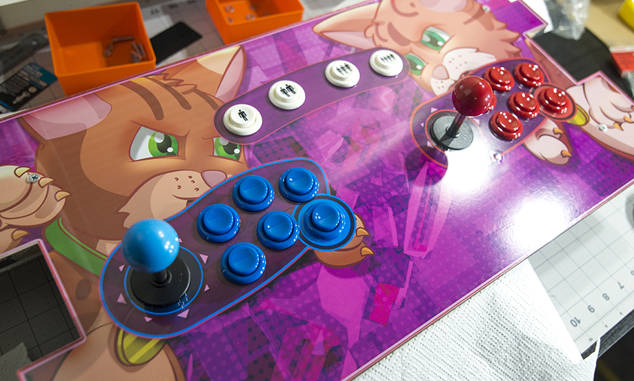
Next up was positioning the 6 Buttons in relation to the Joystick that allows all of the players fingers to comfortably reach and rest without contorting the wrist and arm, this is for both a single player and a two player position. From the same test we discovered the opposite was true from the expectations of the joystick. That the buttons were better at an angle to match the natural resting position of the wrist, and also that the offset angle or line of the buttons in relation to the Joystick movement was irrelevant.
However what made a big difference was the line of the buttons itself, having a 3x2 button grid was uncomfortable after a short time and games requiring all 6 made it difficult to hit those buttons quickly. The solution was to shift up the middle column of the 3x2 grid to match the longer middle finger that humans have.
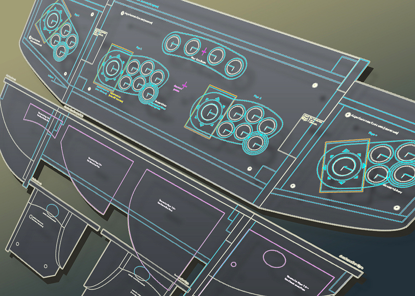
With all this information further 1:1 scale drawings were printed and further refinements were made to the positioning front and back as well as allowing for the wiring that needs to be positioned underneath the panel to ensure it fits into the rest of the cabinet.
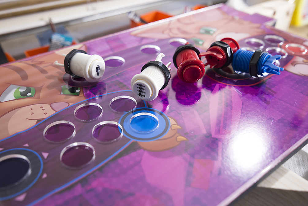
Once the player one and player two Joysticks and button layout restrictions were refined the rest of the control panel layout fell into place easily. It is important to; test your layout at full scale and be prepared to make changes, allow for electronic and wiring components underneath, and make sure you have room at the front for the players wrists to rest on the panel. Our cabinet control panel layout went through 4 full scale tests before settling on the final design. The last changes were mostly moving the grouped layout of the Joystick and 6 Buttons for each player up down left and right to maximise spacing between, while allowing for the wrist to also rest on the Control Panel.
#arcade
