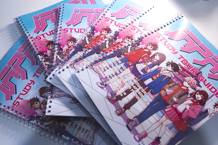
As part of a school overseas trip to Japan we were asked to create a diary for the Students to be able to document their travels. Usually when traveling overseas there are plenty of photos taken as well as lots of souvenirs brought back home. However, we find that after a few years it becomes difficult to remember the name of that one location you visited that had that thing you wanted to go back to. Sometimes good intensions are had if you take a generic notebook with you, but these are mostly left blank if not organised properly. It made sense to us to design and create a tour book specifically for the journey the students are about to embark upon, with specific organised sections to fill out.
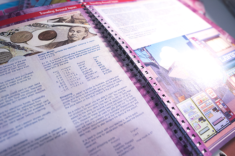
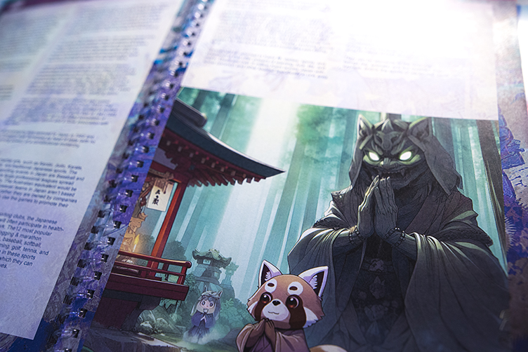
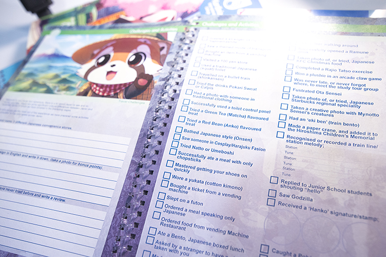
As the book is designed specifically for this trip it can also contain all the itinerary information with it, which is helpful if the students don’t have access to electronic devices or the internet. It can also contain more helpful information about the trip they are on relevant to the experiences they are going to partake in. From here, the content of the book only grew with information about packing lists, Japanese customs, etiquette, nuances, and addresses. It got bigger as spaces for emergency contact numbers and what to do in case of an earthquake was included. Finally some activities for the Students to fill out, and a scavenger hunt to complete during their travels was added.
The last big chunk of information was about the nuances of the home stay portion of the trip. Information about how to resolve issues that may occur, with further etiquette and expectations that may be faced while living with a family for a week. Most importantly it contains pages to log a journal entry for each day of the trip, with suggested spaces to write down place names, contact details, and weather information.
The books were handed out to the students to go over it with their parents a few weeks before the trip, to help answer questions they may have and alleviate any concerns. Full of information-graphics, pictures, and colour coordinated for each section of the book to help make finding information easy. The styling and cover of the book was intentionally made cheerful, bright, and unique with the hope that this will become a keepsake for the students on the trip to help remember their journey and make their first experience of Japan an exciting one.
#design